部落格

  • fastjason常用方法

    fastjason常用方法

    什麼是fastjson?

    Fastjson是一個Java語言編寫的高性能功能完善的JSON庫。它採用一種“假定有序快速匹配”的算法,把JSON Parse的性能提升到極致,是目前Java語言中最快的JSON庫。Fastjson接口簡單易用,已經被廣泛使用在緩存序列化、協議交互、Web輸出、Android客戶端等多種應用場景。

    主要特點:

    • 快速FAST (比其它任何基於Java的解析器和生成器更快,包括jackson)
    • 強大(支持普通JDK類包括任意Java Bean Class、Collection、Map、Date或enum)
    • 零依賴(沒有依賴其它任何類庫除了JDK)

    背景

    最近關於fastjson的消息,引起了很多人的關注!

    fastjson爆出重大漏洞,攻擊者可使整個業務癱瘓

    漏洞描述

    常用JSON組件FastJson存在遠程代碼執行漏洞,攻擊者可通過精心構建的json報文對目標服務器執行任意命令,從而獲得服務器權限。此次爆發的漏洞為以往漏洞中autoType的繞過。

    影響範圍

    FastJson < 1.2.48

    很多開發者才猛然發現,fastjson已經深入到我們開發工作的方方面面。那麼除了趕快升級你的json外,我們來挖挖fastjson最常用的用法。

    fastjson常用方式

    1.maven依賴(記得升級到1.2.48以上版本哦)

            <!-- https://mvnrepository.com/artifact/com.alibaba/fastjson -->
            <dependency>
             <groupId>com.alibaba</groupId>
             <artifactId>fastjson</artifactId>
             <version>1.2.62</version>
            </dependency>    

    2.FastJson對於json格式字符串的解析主要用到了一下三個類:

    (1)JSON:fastJson的解析器,用於JSON格式字符串與JSON對象及javaBean之間的轉換。

    (2)JSONObject:fastJson提供的json對象。

    (3)JSONArray:fastJson提供json數組對象。

    3.常用方式

    3.1 string和java對象


    實例1:對象轉json字符串

            Map<String,String> map=new HashMap<String,String>();
            map.put("code","0");
            map.put("message","ok");
            String json=JSON.toJSONString(map);
            System.out.println(json);

    輸出結果為:

    {"code":"0","message":"ok"}

    實例2:字符串轉對象

            Map<String,String> map=new HashMap<String,String>();
            map.put("code","0");
            map.put("message","ok");
            String json=JSON.toJSONString(map);
            System.out.println(json);
            
            Map obj=(Map)JSON.parse(json);
            System.out.println("code="+obj.get("code")+",message="+obj.get("message"));

    輸出結果

    {"code":"0","message":"ok"}
    code=0,message=ok

    3.2 工具類JSONObject

        public static void main(String[] args) {
            Map<String,String> map=new HashMap<String,String>();
            map.put("code","0");
            map.put("message","ok");
            String json=JSON.toJSONString(map);
            System.out.println(json);
            
            Map obj=(Map)JSON.parse(json);
            System.out.println("code="+obj.get("code")+",message="+obj.get("message"));        
            
            String code=JSON.parseObject(json).getString("code");
            String message=JSON.parseObject(json).getString("message");
            System.out.println("code="+code+",message="+message);
        }

    輸出結果

    {"code":"0","message":"ok"}
    code=0,message=ok
    code=0,message=ok

    3.3 數組對象

    List<user> list=new ArrayList<user>(JSONArray.parseArray(jsonString,user.class)); 

    Fastjson 與各種JSON庫的性能比較:


    json庫 序列化性能 反序列化性能 jar大小
    fastjson 1201 1216 fastjson-1.1.26.jar(356k)
    fastjson-1.1.25-android.jar(226k)
    jackson 1408 1915 jackson-annotations-2.1.1.jar(34k)
    jackson-core-2.1.1.jar(206k)
    jackson-databind-2.1.1.jar(922k)
    總共1162k
    gson 7421 5065 gson-2.2.2.jar(189k)
    json-lib 27555 87292 json-lib-2.4-jdk15.jar(159k)


    本站聲明:網站內容來源於博客園,如有侵權,請聯繫我們,我們將及時處理【其他文章推薦】

    台北網頁設計公司這麼多,該如何挑選?? 網頁設計報價省錢懶人包"嚨底家"

    網頁設計公司推薦更多不同的設計風格,搶佔消費者視覺第一線

    ※想知道購買電動車哪裡補助最多?台中電動車補助資訊懶人包彙整

  • Spring Boot2 系列教程(二十五)Spring Boot 整合 Jpa 多數據源

    Spring Boot2 系列教程(二十五)Spring Boot 整合 Jpa 多數據源

    本文是 Spring Boot 整合數據持久化方案的最後一篇,主要和大夥來聊聊 Spring Boot 整合 Jpa 多數據源問題。在 Spring Boot 整合JbdcTemplate 多數據源、Spring Boot 整合 MyBatis 多數據源以及 Spring Boot 整合 Jpa 多數據源這三個知識點中,整合 Jpa 多數據源算是最複雜的一種,也是很多人在配置時最容易出錯的一種。本文大夥就跟着松哥的教程,一步一步整合 Jpa 多數據源。

    工程創建

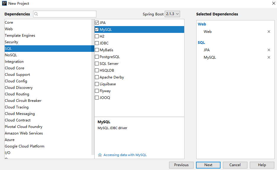
    首先是創建一個 Spring Boot 工程,創建時添加基本的 Web、Jpa 以及 MySQL 依賴,如下:

    創建完成后,添加 Druid 依賴,這裏和前文的要求一樣,要使用專為 Spring Boot 打造的 Druid,大夥可能發現了,如果整合多數據源一定要使用這個依賴,因為這個依賴中才有 DruidDataSourceBuilder,最後還要記得鎖定數據庫依賴的版本,因為可能大部分人用的還是 5.x 的 MySQL 而不是 8.x。完整依賴如下:

    <dependency>
        <groupId>org.springframework.boot</groupId>
        <artifactId>spring-boot-starter-data-jpa</artifactId>
    </dependency>
    <dependency>
        <groupId>org.springframework.boot</groupId>
        <artifactId>spring-boot-starter-web</artifactId>
    </dependency>
    <dependency>
        <groupId>com.alibaba</groupId>
        <artifactId>druid-spring-boot-starter</artifactId>
        <version>1.1.10</version>
    </dependency>
    <dependency>
        <groupId>mysql</groupId>
        <artifactId>mysql-connector-java</artifactId>
        <version>5.1.28</version>
        <scope>runtime</scope>
    </dependency>

    如此之後,工程就創建成功了。

    基本配置

    在基本配置中,我們首先來配置多數據源基本信息以及 DataSource,首先在 application.properties 中添加如下配置信息:

    #  數據源一
    spring.datasource.one.username=root
    spring.datasource.one.password=root
    spring.datasource.one.url=jdbc:mysql:///test01?useUnicode=true&characterEncoding=UTF-8
    spring.datasource.one.type=com.alibaba.druid.pool.DruidDataSource
    
    #  數據源二
    spring.datasource.two.username=root
    spring.datasource.two.password=root
    spring.datasource.two.url=jdbc:mysql:///test02?useUnicode=true&characterEncoding=UTF-8
    spring.datasource.two.type=com.alibaba.druid.pool.DruidDataSource
    
    # Jpa配置
    spring.jpa.properties.database=mysql
    spring.jpa.properties.show-sql=true
    spring.jpa.properties.database-platform=mysql
    spring.jpa.properties.hibernate.ddl-auto=update
    spring.jpa.properties.hibernate.dialect=org.hibernate.dialect.MySQL57Dialect

    這裏 Jpa 的配置和上文相比 key 中多了 properties,多數據源的配置和前文一致,然後接下來配置兩個 DataSource,如下:

    @Configuration
    public class DataSourceConfig {
        @Bean
        @ConfigurationProperties(prefix = "spring.datasource.one")
        @Primary
        DataSource dsOne() {
            return DruidDataSourceBuilder.create().build();
        }
        @Bean
        @ConfigurationProperties(prefix = "spring.datasource.two")
        DataSource dsTwo() {
            return DruidDataSourceBuilder.create().build();
        }
    }

    這裏的配置和前文的多數據源配置基本一致,但是注意多了一個在 Spring 中使用較少的註解 @Primary,這個註解一定不能少,否則在項目啟動時會出錯,@Primary 表示當某一個類存在多個實例時,優先使用哪個實例。

    好了,這樣,DataSource 就有了。

    多數據源配置

    接下來配置 Jpa 的基本信息,這裏兩個數據源,我分別在兩個類中來配置,先來看第一個配置:

    @Configuration
    @EnableJpaRepositories(basePackages = "org.javaboy.jpa.dao",entityManagerFactoryRef = "localContainerEntityManagerFactoryBeanOne",transactionManagerRef = "platformTransactionManagerOne")
    public class JpaConfigOne {
        @Autowired
        @Qualifier(value = "dsOne")
        DataSource dsOne;
        @Autowired
        JpaProperties jpaProperties;
        @Bean
        @Primary
        LocalContainerEntityManagerFactoryBean localContainerEntityManagerFactoryBeanOne(EntityManagerFactoryBuilder builder) {
            return builder.dataSource(dsOne)
                    .packages("org.javaboy.jpa.model")
                    .properties(jpaProperties.getProperties())
                    .persistenceUnit("pu1")
                    .build();
        }
        @Bean
        PlatformTransactionManager platformTransactionManagerOne(EntityManagerFactoryBuilder builder) {
            LocalContainerEntityManagerFactoryBean factoryBeanOne = localContainerEntityManagerFactoryBeanOne(builder);
            return new JpaTransactionManager(factoryBeanOne.getObject());
        }
    }

    首先這裏注入 dsOne,再注入 JpaProperties,JpaProperties 是系統提供的一個實例,裡邊的數據就是我們在 application.properties 中配置的 jpa 相關的配置。然後我們提供兩個 Bean,分別是 LocalContainerEntityManagerFactoryBean 和 PlatformTransactionManager 事務管理器,不同於 MyBatis 和 JdbcTemplate,在 Jpa 中,事務一定要配置。在提供 LocalContainerEntityManagerFactoryBean 的時候,需要指定 packages,這裏的 packages 指定的包就是這個數據源對應的實體類所在的位置,另外在這裏配置類上通過 @EnableJpaRepositories 註解指定 dao 所在的位置,以及 LocalContainerEntityManagerFactoryBean 和 PlatformTransactionManager 分別對應的引用的名字。

    好了,這樣第一個就配置好了,第二個基本和這個類似,主要有幾個不同點:

    • dao 的位置不同
    • persistenceUnit 不同
    • 相關 bean 的名稱不同

    注意實體類可以共用。

    代碼如下:

    @Configuration
    @EnableJpaRepositories(basePackages = "org.javaboy.jpa.dao2",entityManagerFactoryRef = "localContainerEntityManagerFactoryBeanTwo",transactionManagerRef = "platformTransactionManagerTwo")
    public class JpaConfigTwo {
        @Autowired
        @Qualifier(value = "dsTwo")
        DataSource dsTwo;
        @Autowired
        JpaProperties jpaProperties;
        @Bean
        LocalContainerEntityManagerFactoryBean localContainerEntityManagerFactoryBeanTwo(EntityManagerFactoryBuilder builder) {
            return builder.dataSource(dsTwo)
                    .packages("org.javaboy.jpa.model")
                    .properties(jpaProperties.getProperties())
                    .persistenceUnit("pu2")
                    .build();
        }
        @Bean
        PlatformTransactionManager platformTransactionManagerTwo(EntityManagerFactoryBuilder builder) {
            LocalContainerEntityManagerFactoryBean factoryBeanTwo = localContainerEntityManagerFactoryBeanTwo(builder);
            return new JpaTransactionManager(factoryBeanTwo.getObject());
        }
    }

    接下來,在對應位置分別提供相關的實體類和 dao 即可,數據源一的 dao 如下:

    package org.javaboy.jpa.dao;
    public interface UserDao extends JpaRepository<User,Integer> {
        List<User> getUserByAddressEqualsAndIdLessThanEqual(String address, Integer id);
        @Query(value = "select * from t_user where id=(select max(id) from t_user)",nativeQuery = true)
        User maxIdUser();
    }

    數據源二的 dao 如下:

    package org.javaboy.jpa.dao2;
    public interface UserDao2 extends JpaRepository<User,Integer> {
        List<User> getUserByAddressEqualsAndIdLessThanEqual(String address, Integer id);
    
        @Query(value = "select * from t_user where id=(select max(id) from t_user)",nativeQuery = true)
        User maxIdUser();
    }

    共同的實體類如下:

    package org.javaboy.jpa.model;
    @Entity(name = "t_user")
    public class User {
        @Id
        @GeneratedValue(strategy = GenerationType.IDENTITY)
        private Integer id;
        private String username;
        private String address;
        //省略getter/setter
    }

    到此,所有的配置就算完成了,接下來就可以在 Service 中注入不同的 UserDao,不同的 UserDao 操作不同的數據源。

    其實整合 Jpa 多數據源也不算難,就是有幾個細節問題,這些細節問題解決,其實前面介紹的其他多數據源整個都差不多。

    好了,本文就先介紹到這裏。

    相關案例已經上傳到 GitHub,歡迎小夥伴們們下載:

    掃碼關注松哥,公眾號後台回復 2TB,獲取松哥獨家 超2TB 免費 Java 學習乾貨

    本站聲明:網站內容來源於博客園,如有侵權,請聯繫我們,我們將及時處理【其他文章推薦】

    ※想知道網站建置網站改版該如何進行嗎?將由專業工程師為您規劃客製化網頁設計後台網頁設計

    ※不管是台北網頁設計公司台中網頁設計公司,全省皆有專員為您服務

    ※Google地圖已可更新顯示潭子電動車充電站設置地點!!

    ※帶您來看台北網站建置台北網頁設計,各種案例分享

  • CSS:CSS彈性盒子布局 Flexible Box

    CSS:CSS彈性盒子布局 Flexible Box

    一、簡介

    flexbox:全稱Flexible Box, 彈性盒子布局。可以簡單實現各種伸縮性的設計,它是由伸縮容器和伸縮項目組成。任何一個元素都可以指定為flexbox布局。這種新的布局方案在2009年是由W3C組織提出來的,在此之前,Web開發一般使用基於盒子模型的傳統頁面布局,依賴定位屬性、流動屬性和显示屬性來解決,參看鏈接:。彈性盒子布局的出現,極大的方便了開發者,在如今的ReactNative開發中,也已經被引入使用。

    伸縮流布局結構圖如下:

    彈性盒子布局具備的特徵:

    1、伸縮容器的子元素稱為伸縮項目,伸縮項目使用伸縮布局來排版。伸縮布局和傳統布局不一樣,它按照伸縮流方向布局。

    2、伸縮容器由兩條軸構成,分別為主軸(main axis)和交叉軸(cross axis)。主軸既可以用水平軸,也可以是豎直軸,根據開發者需要來決定。

    3、主軸的起點叫main start,終點叫main end,主軸的空間用main size表示。

    4、交叉軸的起點叫cross start,終點叫cross end,交叉軸的空間用cross size表示。

    5、默認情況下,伸縮項目總是沿着主軸方向排版,從開始位置到終點位置。至於換行显示,則通過設置伸縮屬性來實現。

    6、伸縮容器的屬性有:display、flex-direction、flex-wrap、flex-flow、justify-content、align-items、align-content

    7、伸縮項目的屬性有: order、flex-grow、flex-shrink、flex-basis、flex、align-self


    二、伸縮容器的屬性,全局設置排版

    HTML:[注意:下面的演示截圖項目個數會根據需要選擇性註釋“flex-item”,有時用不到5個]

    <!DOCTYPE html>
    <html>
    <head>
        <title>Flexbox</title>
        <!--  採用外聯方式導入css文件 -->
        <link rel="stylesheet" type="text/css" href="./css_test.css">
    </head>
    <body>
        <span class="flex-container"> 
            <span class="flex-item" id="item1" style="color:white;font-size:20px">1</span>
            <span class="flex-item" id="item2" style="color:white;font-size:20px">2</span>
            <span class="flex-item" id="item3" style="color:white;font-size:20px">3</span>
            <span class="flex-item" id="item4" style="color:white;font-size:20px">4</span>
            <span class="flex-item" id="item5" style="color:white;font-size:20px">5</span>
        </span>
    </body>
    </html> 

    1、display:決定元素是否為伸縮容器

    • flex:產生塊級伸縮容器
      .flex-container {
           display: flex;
       }
    • inline-flex:產生行內塊級伸縮容器
    •  .flex-container {
           display: inline-flex;
       }

    2、flex-direction:指定伸縮容器主軸的方向

    • row:水平方向,從左到右
       .flex-container {
           display: flex;
           flex-direction: row;
           width: 160px;
           height: 160px;
           background-color: red;
       }
      
       .flex-item {
           width: 50px; 
           height: 50px;
           background-color: green;
           margin: 1px;
       }

    • row-reverse:水平方向,從右到左
       .flex-container {
           display: flex;
           flex-direction: row-reverse;
           width: 160px;
           height: 160px;
           background-color: red;
       }
      
       .flex-item {
           width: 50px; 
           height: 50px;
           background-color: green;
           margin: 1px;
       }

    • column:豎直方向,從上到下
       .flex-container {
           display: flex;
           flex-direction: column;
           width: 160px;
           height: 160px;
           background-color: red;
       }
      
       .flex-item {
           width: 50px;
           height: 50px; 
           background-color: green;
           margin: 1px;
       }

    • column-reverse:豎直方向,從下到上
       .flex-container {
           display: flex;
           flex-direction: column-reverse;
           width: 160px;
           height: 160px;
           background-color: red;
       }
      
       .flex-item {
           width: 50px;
           height: 50px; 
           background-color: green;
           margin: 1px;
       }

    3、flex-wrap:指定伸縮容器主軸方向空間不足時,決定是否換行以及換行方式

    • nowarp:不換行
      .flex-container {
           display: flex;
           flex-direction: row;
           flex-wrap: nowrap;
           width: 160px;
           height: 160px;
           background-color: red;
       }
      
       .flex-item {
           width: 50px; //下圖單行狀態寬度被重新計算
           height: 50px;
           background-color: green;
           margin: 1px;
       }

    • warp:換行,若主軸為水平方向,換行方向是從上到下
       .flex-container {
           display: flex;
           flex-direction: row;
           flex-wrap: wrap;
           width: 160px;
           height: 160px;
           background-color: red;
       }
      
       .flex-item {
           width: 50px;
           height: 50px;
           background-color: green;
           margin: 1px;
       }

    • wrap-reverse:換行,若主軸為水平方向,換行方向是從下到上
       .flex-container {
           display: flex;
           flex-direction: row;
           flex-wrap: wrap-reverse;
           width: 160px;
           height: 160px;
           background-color: red;
       }
      
       .flex-item {
           width: 50px;
           height: 50px;
           background-color: green;
           margin: 1px;
       }

    4、flex-flow:flex-direction和flex-wrap的縮寫,同時指定伸縮容器主軸方向和換行設置

    • row nowrap:默認主軸是水平方向,從左到右,且不換行
       .flex-container {
           display: flex;
           flex-flow: row nowrap;
           width: 160px;
           height: 160px;
           background-color: red;
       }
      
       .flex-item {
           width: 50px; //下圖單行狀態寬度被重新計算
           height: 50px;
           background-color: green;
           margin: 1px;
       }

    5、justify-content:決定伸縮項目沿着主軸線的對齊方式

    • flex-start:與主軸線起始位置靠齊
       .flex-container {
           display: flex;
           flex-flow: row wrap;
           justify-content: flex-start;
           width: 160px;
           height: 160px;
           background-color: red;
       }
      
       .flex-item {
           width: 50px;
           height: 50px;
           background-color: green;
           margin: 1px;
       }

    • flex-end:與主軸線結束位置靠齊
       .flex-container {
           display: flex;
           flex-flow: row wrap;
           justify-content: flex-end;
           width: 160px;
           height: 160px;
           background-color: red;
       }
      
       .flex-item {
           width: 50px;
           height: 50px;
           background-color: green;
           margin: 1px;
       }

    • center:與主軸線中間位置靠齊
       .flex-container {
           display: flex;
           flex-flow: row wrap;
           justify-content: center;
           width: 160px;
           height: 160px;
           background-color: red;
       }
      
       .flex-item {
           width: 50px;
           height: 50px;
           background-color: green;
           margin: 1px;
       }

    • space-between:平均分配到主軸線里,第一個項目靠齊起始位置,最後一個項目靠齊終點位置
       .flex-container {
           display: flex;
           flex-flow: row wrap;
           justify-content: space-between;
           width: 160px;
           height: 160px;
           background-color: red;
       }
      
       .flex-item {
           width: 50px;
           height: 50px;
           background-color: green;
           margin: 1px;
       }

    • sapce-around:平均分配到主軸線里,兩端保留一半的空間
      .flex-container {
           display: flex;
           flex-flow: row wrap;
           justify-content: space-around;
           width: 160px;
           height: 160px;
           background-color: red;
       }
      
       .flex-item {
           width: 50px;
           height: 50px;
           background-color: green;
           margin: 1px;
       }

    6、align-items:決定伸縮項目不能換行時沿着交叉軸線的對齊方式

    • flex-start:與交叉軸線起始位置靠齊
       .flex-container {
           display: flex;
           flex-flow: row nowrap;
           align-items: flex-start;
           width: 160px;
           height: 160px;
           background-color: red;
       }
      
       .flex-item {
           width: 50px; //下圖單行狀態寬度被重新計算
           height: 50px;
           background-color: green;
           margin: 1px;
       }

    • flex-end:與交叉軸線結束位置靠齊
       .flex-container {
           display: flex;
           flex-flow: row nowrap;
           align-items: flex-end;
           width: 160px;
           height: 160px;
           background-color: red;
       }
      
       .flex-item {
           width: 50px; //下圖單行狀態寬度被重新計算
           height: 50px;
           background-color: green;
           margin: 1px;
       }

    • center:與交叉軸線中間位置靠齊
       .flex-container {
           display: flex;
           flex-flow: row nowrap;
           align-items: center;
           width: 160px;
           height: 160px;
           background-color: red;
       }
      
       .flex-item {
           width: 50px;
           height: 50px;
           background-color: green;
           margin: 1px;
       }

    • baseline:根據基線對齊
       .flex-container {
           display: flex;
           flex-flow: row nowrap;
           align-items: baseline;
           width: 160px;
           height: 160px;
           background-color: red;
       }
      
       .flex-item {
           width: 50px;
           height: 50px;
           background-color: green;
           margin: 1px;
       }
      
       #item1 {
           padding-top: 25px;
       }
      
       #item2 {
           padding-top: 20px;
       }
        
       #item3 {
           padding-top: 15px;
       }
      
       #item4 {
           padding-top: 10px;
       }
        
       #item5 {
           padding-top: 5px;
       }

    • stretch:沿着交叉軸線拉伸填充整個伸縮容器
       .flex-container {
           display: flex;
           flex-flow: row nowrap;
           align-items: stretch;
           width: 160px;
           height: 160px;
           background-color: red;
       }
      
       .flex-item {
           width: 50px;//此時可以設置寬度,但不能設置高度,否則無法拉伸
           background-color: green;
           margin: 1px;
       }

    7、align-content:決定伸縮項目可以換行時沿着交叉軸線的對齊方式,flex-warp:warp一定要開啟

    • flex-start:與交叉軸線起始位置靠齊
       .flex-container {
           display: flex;
           flex-flow: row wrap;
           align-content:flex-start;
           width: 160px;
           height: 160px;
           background-color: red;
       }
      
       .flex-item {
           width: 50px;
           height: 50px;
           background-color: green;
           margin: 1px;
       }

    • flex-end:與交叉軸線結束位置靠齊
       .flex-container {
           display: flex;
           flex-flow: row wrap;
           align-content:flex-end;
           width: 160px;
           height: 160px;
           background-color: red;
       }
      
       .flex-item {
           width: 50px;
           height: 50px;
           background-color: green;
           margin: 1px;
       }

    • center:與主軸線中間位置靠齊
       .flex-container {
           display: flex;
           flex-flow: row wrap;
           align-content:center;
           width: 160px;
           height: 160px;
           background-color: red;
       }
      
       .flex-item {
           width: 50px;
           height: 50px;
           background-color: green;
           margin: 1px;
       }

    • space-between:平均分配到主軸線里,第一行項目靠齊起始位置,最後一行項目靠齊終點位置
       .flex-container {
           display: flex;
           flex-flow: row wrap;
           align-content:space-between;
           width: 160px;
           height: 160px;
           background-color: red;
       }
      
       .flex-item {
           width: 50px;
           height: 50px;
           background-color: green;
           margin: 1px;
       }

    • sapce-around:所有行平均分配到主軸線里,兩端保留一半的空間
       .flex-container {
           display: flex;
           flex-flow: row wrap;
           align-content:space-around;
           width: 160px;
           height: 160px;
           background-color: red;
       }
      
       .flex-item {
           width: 50px;
           height: 50px;
           background-color: green;
           margin: 1px;
       }

    • stretch:沿着交叉軸
       .flex-container {
           display: flex;
           flex-flow: row wrap;
           align-content:stretch;
           width: 160px;
           height: 160px;
           background-color: red;
       }
      
       .flex-item {
           width: 50px; //不要設置高度,不然無法拉伸
           background-color: green;
           margin: 1px;
       }


    三、伸縮項目的屬性,單個設置排版

    1、order:定義伸縮項目的排列順序。數值越小,排列越靠前,默認值為0。

    • 表達式 order: integer;
       .flex-container {
           display: flex;
           flex-flow: row wrap;
           width: 160px;
           height: 160px;
           background-color: red;
       }
      
       .flex-item {
           width: 50px;
           height: 50px;
           background-color: green;
           margin: 1px;
       }
      
       #item4 {
           order: -1;
       }
      
       #item5 {
           order: -2;
       }

    2、flex-grow:定義伸縮項目的放大比例,默認值為0,表示即使存在剩餘空間,也不放大。

    • 表達式 flex-grow: number;
       .flex-container {
           display: flex;
           flex-flow: row wrap;
           width: 160px;
           height: 160px;
           background-color: red;
       }
      
       .flex-item {
           width: 50px;
           height: 50px;
           background-color: green;
           margin: 1px;
       }
      
       #item2 {
           flex-grow: 1; //空間不足,item2不會放大
       }
      
       #item4 {
           flex-grow: 1; //item4放大填滿剩餘空間
       }

    3、flex-shrink:定義伸縮項目的收縮比例,默認值為1。

    • 表達式 flex-shrink: numer;
      .flex-container {
           display: flex;
           flex-flow: row nowrap;
           width: 160px;
           height: 160px;
           background-color: red;
       }
      
       .flex-item {
           width: 50px;
           height: 50px;
           background-color: green;
           margin: 1px;
       }
      
       #item4 {
           flex-shrink:3; //單行,空間有限,item4縮小為原來的1/3
       }
      
       #item5 {
           flex-shrink:4;  //單行,空間有限,item5縮小為原來的1/5
      }

    4、flex-basis:定義伸縮項目的基準值,剩餘空間按照比例進行伸縮,默認auto。

    •  auto
       .flex-container {
           display: flex;
           flex-flow: row wrap;
           width: 160px;
           height: 160px;
           background-color: red;
       }
      
       .flex-item {
           width: 50px;
           height: 50px;
           background-color: green;
           margin: 1px;
       }
      
       #item5 {
           flex-basis:auto;
       }


    • flex-basis: length 
       .flex-container {
           display: flex;
           flex-flow: row wrap;
           width: 160px;
           height: 160px;
           background-color: red;
       }
      
       .flex-item {
           width: 50px;
           height: 50px;
           background-color: green;
           margin: 1px;
       }
      
       #item5 {
           flex-basis:200px;
       }

    5、flex:是flex-grow、flex-shrink、flex-basis的縮寫,默認值 0 1 auto。

    • none: 不設置
       .flex-container {
           display: flex;
           flex-flow: row wrap;
           width: 160px;
           height: 160px;
           background-color: red;
       }
      
       .flex-item {
           width: 50px;
           height: 50px;
           background-color: green;
           margin: 1px;
       }
      
       #item2 {
           flex: none; /* 等同於 flex: 0 0 auto */
       }

    • flex-grow flex-shrink flex-basis: 設置放大或縮小或基準線
       .flex-container {
           display: flex;
           flex-flow: row wrap;
           width: 160px;
           height: 160px;
           background-color: red;
       }
      
       .flex-item {
           width: 50px;
           height: 50px;
           background-color: green;
           margin: 1px;
       }
      
       #item2 {
           flex: 1; /* 等同於 flex: 1 1 auto 或者 等同於 flex: auto*/
       }

    6、align-self:用來設置伸縮項目在交叉軸的對齊方式。

    • auto:自動對齊
       .flex-container {
           display: flex;
           flex-flow: row wrap;
           width: 160px;
           height: 160px;
           background-color: red;
       }
      
       .flex-item {
           width: 50px;
           height: 50px;
           background-color: green;
           margin: 1px;
       }
      
       #item3 {
           align-self: auto;
       }

    • flex-start: 向交叉軸的開始位置對齊
       .flex-container {
           display: flex;
           flex-flow: row wrap;
           width: 160px;
           height: 160px;
           background-color: red;
       }
      
       .flex-item {
           width: 50px;
           height: 50px;
           background-color: green;
           margin: 1px;
       }
      
       #item3 {
           align-self: flex-start;
       }

    • flex-end: 向交叉軸的結束位置對齊
       .flex-container {
           display: flex;
           flex-flow: row wrap;
           width: 160px;
           height: 160px;
           background-color: red;
       }
      
       .flex-item {
           width: 50px;
           height: 50px;
           background-color: green;
           margin: 1px;
       }
      
       #item3 {
           align-self: flex-end;
       }

    • center: 向交叉軸的中間位置對齊
       .flex-container {
           display: flex;
           flex-flow: row wrap;
           width: 160px;
           height: 160px;
           background-color: red;
       }
      
       .flex-item {
           width: 50px;
           height: 50px;
           background-color: green;
           margin: 1px;
       }
      
       #item3 {
           align-self: center;
       }

    • baseline:向交叉軸的基準線對齊
       .flex-container {
           display: flex;
           flex-flow: row wrap;
           width: 160px;
           height: 160px;
           background-color: red;
       }
      
       .flex-item {
           width: 50px;
           height: 50px;
           background-color: green;
           margin: 1px;
       }
      
       #item1 {
           align-self: baseline;
           margin-top: 50px;
       }
      
       #item2 {
           align-self: baseline;
       }

    • stretch: 在交叉軸拉伸填滿伸縮容器
       .flex-container {
           display: flex;
           flex-flow: row wrap;
           width: 160px;
           height: 160px;
           background-color: red;
       }
      
       .flex-item {
           width: 50px;
           background-color: green;
           margin: 1px;
       }
      
       #item1 {
           align-self: stretch;
       }
      
       #item2 {
           align-self: stretch;
       }
      
       #item3 {
           align-self: stretch;
       }


    本站聲明:網站內容來源於博客園,如有侵權,請聯繫我們,我們將及時處理【其他文章推薦】

    網頁設計公司推薦更多不同的設計風格,搶佔消費者視覺第一線

    ※廣告預算用在刀口上,網站設計公司幫您達到更多曝光效益

    ※自行創業 缺乏曝光? 下一步"網站設計"幫您第一時間規劃公司的門面形象

  • 電動車電池成長,帶動致茂營收倍翻

    受惠於電動車動力電池需求增加,致茂電子的七月合併營收創下歷史新高。今年前七個月的累計營收更已與去年全年相當。

    致茂電子表示,因電動車動力電池製造的關鍵技術(turnkey solutions)銷售蓬勃,帶動七月營收大漲,合併營收達新台幣16.2億元,不僅較上月成長71%、更較去年七月成長101%,營收數字創下歷史新高。

    此外,母公司的7月單月營收也有128%的月增與172%的年增,達新台幣12.6億元。強勁的需求使致茂今年前七個月的合併營收年增27%來到69.1億新台幣;母公司前七個月的累計營收新台幣45億元,也已相當於去年全年水準。

    本站聲明:網站內容來源於EnergyTrend https://www.energytrend.com.tw/ev/,如有侵權,請聯繫我們,我們將及時處理

    【其他文章推薦】

    ※帶您來了解什麼是 USB CONNECTOR  ?

    ※自行創業 缺乏曝光? 下一步"網站設計"幫您第一時間規劃公司的門面形象

    ※如何讓商品強力曝光呢? 網頁設計公司幫您建置最吸引人的網站,提高曝光率!!

    ※綠能、環保無空污,成為電動車最新代名詞,目前市場使用率逐漸普及化

    ※廣告預算用在刀口上,網站設計公司幫您達到更多曝光效益

  • 傳蘋果電動汽車將採用韓國公司的電池技術

    傳蘋果電動汽車將採用韓國公司的電池技術

    根據行業消息,蘋果近期與一家韓國電池開發商簽署了保密協議,聯合為代號為“泰坦”的汽車專案開發電池。從今年初開始,他們一直在韓國做行政工作。一名蘋果員工一直在這家韓國公司進行參觀活動,他屬於與蘋果電動汽車電池開發相關的部門。  
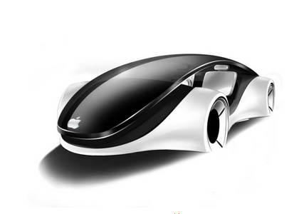
      業界認為,這家韓國公司並不是唯一一家負責蘋果電池開發的公司。不過,有消息稱,儘管蘋果從一開始就從完全不同的設計、功能以及性能角度來開發電池,但是他們仍舊一直在挖掘創新技術。業界相信,蘋果專注于開發出只能存在於蘋果自動駕駛汽車的創新電池技術。   這家韓國電池開發商由大約20名電池專家組成,持有空芯電池的國際專利技術。這些電池是圓柱形鋰離子二次電池,有兩根手指那麼厚,不同於其它空芯電池。蘋果並未選擇當前電動汽車普遍使用的標準圓形或矩形電池,但計畫根據韓國公司的空芯電池技術為其電動汽車開發自主電池。   文章來源:鳳凰科技

    本站聲明:網站內容來源於EnergyTrend https://www.energytrend.com.tw/ev/,如有侵權,請聯繫我們,我們將及時處理

    【其他文章推薦】

    ※為什麼 USB CONNECTOR 是電子產業重要的元件?

    網頁設計一頭霧水??該從何著手呢? 找到專業技術的網頁設計公司,幫您輕鬆架站!

    ※想要讓你的商品成為最夯、最多人討論的話題?網頁設計公司讓你強力曝光

    ※想知道最厲害的台北網頁設計公司推薦台中網頁設計公司推薦專業設計師”嚨底家”!!

  • 蘋果傳將攜手韓廠研發電動車用電池

    蘋果公司持續擴大業務範圍,除新成立的蘋果能源(Apple Energy)成功取得售電許可外,市場上關注度十足的蘋果電動車專案「泰坦計畫」(Project Titan)也時常傳出新消息。近期傳言蘋果將與南韓某企業合作,運用該南韓公司的電池專利,攜手開發電動車用電池。

    根據日本蘋果情報網站iPhone Mania、南韓媒體ET News 等報導,蘋果看上某家南韓廠商所取得的鋰電池專利,打算與該廠合作開發電動車用電池。被看上的鋰電池專利技術,電池中央部位採中空設計,可使空氣流通來冷卻電池,等同降低冷卻系統的需求,騰出更多空間來增加電池容量。

    日、韓媒體並未披露可能將與蘋果合作的韓廠名稱,但美國MacRumors 透剁歐洲專利局得知,這款「中央中空」的電池是由一家稱為Orange Power 的南韓廠商取得。該廠係一小廠,員工人數僅33人,其中多數為研發人員。

    蘋果電動車計畫自曝光以來即備受矚目,但至今仍然只聞樓梯響。據了解,目前共有約1,000人參與蘋果電動車企劃,且蘋果已在柏林設立秘密開發實驗室。MoneyDJ引述The Information網站的說法,表示蘋果電動車可能在2021年亮相;但也有分析師認為,蘋果電動車可能會步上蘋果電視的後塵,胎死腹中。

    本站聲明:網站內容來源於EnergyTrend https://www.energytrend.com.tw/ev/,如有侵權,請聯繫我們,我們將及時處理

    【其他文章推薦】

    USB CONNECTOR掌控什麼技術要點? 帶您認識其相關發展及效能

    ※評比前十大台北網頁設計台北網站設計公司知名案例作品心得分享

    ※智慧手機時代的來臨,RWD網頁設計已成為網頁設計推薦首選

  • 德國頒佈最新電動汽車補貼計畫 共投入12億歐元

    德國頒佈最新電動汽車補貼計畫 共投入12億歐元

    據報導,自7月1日起,德國頒佈最新的電動車補貼計畫,截止目前已經有近2000位申請者,其中寶馬車主占多數。  
      為了促進電動車等環保車型的普及,德國為每位購買電動車的消費者提供4000歐元的補貼,插電式混合動力車的補貼為3000歐元。在計畫實施後,有1791位插電式混合動力車的車主申請了補貼,其中有581位購買了寶馬的車型。同時還有444位申請者購買了雷諾車型,大眾汽車買主為154位。   據統計,目前德國人汽車擁有量為4500萬輛,而其中僅有5萬輛是純電動或者是混合動力車輛。為改善這一情況,德國此次計畫共投入12億歐元,由政府和汽車製造商平攤,希望能夠在2019年6月底,即計畫截止期前售出40萬輛電動車。   文章來源:環球網

    本站聲明:網站內容來源於EnergyTrend https://www.energytrend.com.tw/ev/,如有侵權,請聯繫我們,我們將及時處理

    【其他文章推薦】

    台北網頁設計公司這麼多,該如何挑選?? 網頁設計報價省錢懶人包"嚨底家"

    網頁設計公司推薦更多不同的設計風格,搶佔消費者視覺第一線

    ※想知道購買電動車哪裡補助最多?台中電動車補助資訊懶人包彙整

  • 工信部:第287批申報目錄 純電動汽車型達424款

    工信部:第287批申報目錄 純電動汽車型達424款

    8月10日,工信部對申報《道路機動車輛生產企業及產品公告》(第287批)的車輛新產品進行公示。申報第287批公告的純電動車輛及底盤數量多達424款,插電式混合動力車輛及底盤數量為10款,純電動廂式運輸車車型數量多達129款。  
     
    申報純電動客車車型數量約162款,詳情如下:   安凱9款,星凱龍4款,安達爾1款,北汽福田1款,比亞迪1款,長春北車電動汽車公司3款,長沙梅花汽車2款,成都客車2款,丹東黃海2款,東風汽車5款,東莞中汽宏遠2款,佛山飛馳2款,杭州長江客車2款,少林客車2款,南車時代5款,江蘇九龍1款,常隆客車1款,江蘇陸地方舟16款,江西江鈴4款,江西宜春客車廠1款,金華青年汽車12款,蘇州金龍8款,牡丹汽車2款,南京金龍8款,南京公共交通車輛廠1款,山西原野汽車6款,陝西躍迪1款,申龍客車1款,申沃客車1款,上海萬象1款,深圳五洲龍5款,川汽野馬1款,廈門金龍3款,廈門金旅10款,煙臺舒馳1款,揚子江汽車6款,揚州亞星3款,一汽客車1款,浙江南車電車8款,宇通6款,一汽集團1款,濟南豪沃1款,中通客車2款,中植一客5款,重慶恒通1款,珠海廣通1款。  
    插電式混合動力客車及底盤共10款。具體到企業來看,安凱申報的插電式混合動力客車車型3款,昆明客車1款,揚州亞星2款,中通客車1款,重慶恒通2款。  
    純電動轎車及乘用車的申報車型超過18款。其中,北汽3款,長城1款,東風悅達起亞1款,東風小康2款,合肥長安汽車1款,湖南江南汽車4款,奇瑞3款,榮成華泰1款,浙江吉利1款,力帆1款,比亞迪1款,江蘇卡威1款。   通過梳理第287批申報車型,筆者認為:純電動客車依然會是未來中國新能源汽車市場的主力軍,純電動物流車市場亟待爆發,純電動轎車和乘用車車型數量增多使得消費者的選擇權變大,此領域的競爭格局將會有所改變。第287批公告的公示時間為2016年8月10日至2016年8月16日。   文章來源:蓋世汽車

    本站聲明:網站內容來源於EnergyTrend https://www.energytrend.com.tw/ev/,如有侵權,請聯繫我們,我們將及時處理

    【其他文章推薦】

    ※想知道網站建置網站改版該如何進行嗎?將由專業工程師為您規劃客製化網頁設計後台網頁設計

    ※不管是台北網頁設計公司台中網頁設計公司,全省皆有專員為您服務

    ※Google地圖已可更新顯示潭子電動車充電站設置地點!!

    ※帶您來看台北網站建置台北網頁設計,各種案例分享

  • 蘋果的第一個汽車專利由BAE公司授權 像坦克

    蘋果的第一個汽車專利由BAE公司授權 像坦克

    儘管蘋果公司一直三緘其口,但是對於傳聞中的蘋果電動汽車項目,已經快成為了公開的秘密。現在,蘋果的首個關於汽車技術的專利也被人曝光,不過看起來與我們期望的距離似乎有點遙遠。  
      近日,美國專利商標局通過了一批蘋果公司的新專利,其中一項專利顯示了一種採用履帶以及軌槽設計的交通工具草圖。這項專利其實是兩個貨箱之間的接駁原理,駕駛員可以在極端寒冷空氣條件下,直接,通過加熱裝置,控制第一個車廂的轉向構件及包括一個連接機制的第二個車廂。   據悉,這項專利由瑞典軍用坦克製造商BAE公司授權給蘋果,因此至少目前來看肯定不會被使用在普通的消費和商業領域。   文章來源:騰訊數碼

    本站聲明:網站內容來源於EnergyTrend https://www.energytrend.com.tw/ev/,如有侵權,請聯繫我們,我們將及時處理

    【其他文章推薦】

    網頁設計公司推薦更多不同的設計風格,搶佔消費者視覺第一線

    ※廣告預算用在刀口上,網站設計公司幫您達到更多曝光效益

    ※自行創業 缺乏曝光? 下一步"網站設計"幫您第一時間規劃公司的門面形象

  • 續航力600公里的特斯拉 即將問世?

    續航力600公里的特斯拉 即將問世?

    續航力是電動車最受關注的性能,而作為全球電動車龍頭廠商的特斯拉(Tesla),似乎也準備好要推出續航力更久的車款了。跟據了解,新的特斯拉電動車可能搭載100kW的電池,續航力最遠可達611公里。

    《癮科技》中文版指出,德國監管機關的資料中可查到Model S與Model X的100D與P100D型號的相關資訊;而根據特斯拉為車款型號命名的邏輯,這可能暗示特斯拉將推出搭載100kW電池的車款。

    100kW 的電池搭配Model S,預計最高續航里程可來到611公里,比90D的續航里程多了100公里以上。若搭配Model X,續航里程也可來到480 公里之多。這樣的續航力,將能有效減輕美國車主對駕駛特斯拉跨州旅行的疑慮。

    (照片來源:Tesla 臉書專頁)

    本站聲明:網站內容來源於EnergyTrend https://www.energytrend.com.tw/ev/,如有侵權,請聯繫我們,我們將及時處理

    【其他文章推薦】

    ※如何讓商品強力曝光呢? 網頁設計公司幫您建置最吸引人的網站,提高曝光率!!

    網頁設計一頭霧水??該從何著手呢? 找到專業技術的網頁設計公司,幫您輕鬆架站!

    ※想知道最厲害的台北網頁設計公司推薦台中網頁設計公司推薦專業設計師”嚨底家”!!